The Rise of Augmented Reality in Marketing
Augmented Reality (AR) is no longer just a futuristic concept—it’s here, and it’s revolutionizing the way businesses market their products and...
75% of users will judge your company’s credibility based on how well you can pull off your site’s visual design.
It’s a fact: Good aesthetics set a positive first impression. It also builds trust and reassures them with consistency across your brands.
How can you pull it off though? Making a trendy, edgy, hot website is the holy grail—akin to making the top 3 in Google rankings! It almost doesn’t seem possible.
If that's how you feel, we’re here to help. We’re going to go over some expert tips to help you design your website like (or with) a pro.
Keep scrolling.
Speaking of scrolling, navigation menus on a single-page or multi-page site are essential.
Have you ever gotten to a site that was so hard to navigate (even with a menu) that you felt like you needed a guide to get you through the alleyways? Frustrating, isn’t it?
You also want to avoid a navigation design that is so overly simple it's a hassle to use. As an example, don’t use a hamburger menu on a desktop or landscape tablet format for your site. The wide site formats are just fine with a normal expanded menu style, and the added click turns users away.
Besides your website, a hamburger menu isn’t really used anywhere else on a desktop computer. It only makes sense for a website viewed on a phone or tablet, where you have limited space on the screen.
You don’t want to offer so many navigation choices that you confuse your users, but not so few they have to do extra work. Combine menu categories where it's logical to do so, and split them where you absolutely must.
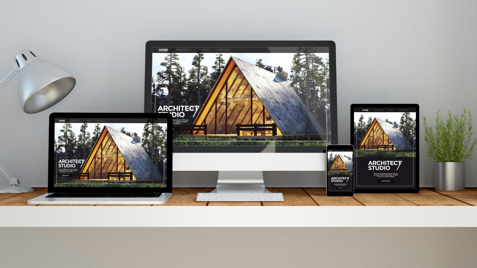
Responsive design has become standard, but the focus should be small to large. Many designers are designing on a desktop, and so the default mental state might erroneously start there.
However, designing with smaller devices (like phones) in mind first is a best practice for responsive design. This might seem counterintuitive, but people use a desktop for a longer period of time than a mobile device.
There's a smaller space to work with on a phone, and because of that restriction, more attention goes to presenting information logically. This doesn’t always translate well to desktop.
That being said, white space on a desktop is not your enemy. Giving people space between page elements not only gives a unique experience to desktop users, but it also eliminates huge, intimidating blocks of copy.
Consistency within your branding gives users a sense of ease and comfort. If they aren’t shocked by an ever-changing landscape of design on your page, they will be better equipped to use it in a functional way.
That being said, you need variety that falls within the consistency rules of your brand. The rules for your brand are in what is called a style guide.
Style guides are used by designers to determine how to use your logo and what colors and typography best convey your brand. This ensures that your brand is consistent across digital and print mediums.
Speaking of typography and web design, you’ll alienate 38% of people just by having poorly written copy. A website that's full of typos and grammatical errors will make you look cheap and unreliable.
How so? Customers will either assume you're not an expert in your niche or you're not concerned about high-quality work. With a first impression like that, how do you think they'll feel about your product or service?
Customers visiting your poorly written website might rightly wonder about who you use to make your products (and the resulting quality). They'll form these impressions with one glance at your site, so you've got one chance to get it right.
People love graphics. In many Asian countries, users love cute custom buttons in the shape of cartoon characters and stylized animals.
This example might not work for your brand, but a custom button is a clear indicator of action. The whole point of a call to action is to lead your customer through a sales funnel of some kind. That is, from inspiration to transaction.
Asking them to go out of their way to do something or providing a text link at the end of a paragraph isn’t enough. Give them a purposeful and clear indicator that they’re taking action. They need a button or an icon—they expect one.
Design isn’t just a plan or an intention. It's following a detailed plan with a clearly focused goal. If you only made visual decisions based on a feeling or a whim, you won’t get far.
As with anything technical, it's backed by science. There are many studies on why certain trends succeed or fail. This includes color psychology, typography, demography, market saturation, psychology, and sociology.
There's a reason that graphic and web designers go through rigorous business and psychology courses, in addition to fine arts training. A successful designer is what you get when you have equal parts of both.
All of these considerations together will affect your load time on your page. Going too big with animations makes the site feel cluttered. It also increases script sizes, which the browser and server must resolve.
These factors combined increase page load times, which is not good news for your site. In fact, 53% of mobile users will leave if your site hasn’t opened in 3 seconds or less.
Too many visuals, too many animations, and too many scripts or plugins have a negative impact on your site's SEO and user experience. In this case, less is definitely more.
Usability is the main goal of good design. To be usable, it has to look good and work well.
Visual design (sometimes called graphic design) works with website design so closely that you can hardly distinguish the two. You want to design beautifully, and design with function in mind.
If you follow these suggestions, you’ll be designing like a pro in no time flat.
Are you looking for more help with website design or management? Contact us today and let's discuss your project.

Augmented Reality (AR) is no longer just a futuristic concept—it’s here, and it’s revolutionizing the way businesses market their products and...

Running a small business can feel like an uphill battle, especially when it comes to marketing. Limited budgets, fierce competition, and the constant...

In the digital age, building a strong community around your small business isn’t just a “nice-to-have”—it’s essential for growth and long-term...

In the bustling world of small business, efficiency and creativity are paramount. Enter Canva, a user-friendly graphic design tool that's perfect for...

Did you know that over one-third of small businesses in the U.S. still don't have websites? Websites have become an essential part of any business,...

In today’s digital-first world, having an online presence is no longer just an option for small businesses—it's a necessity. But you might be...